flex网页布局首选方案 灵活应用css flex弹性布局快速构建web结构
归类于 css » 🏹系统分享 👋分享到微博 当前评论 1 条。
传统页面基础布局我们时常会使用position、float等一些css属性对其修饰,进而达到设计效果,想必经历过的亲们都感觉到很是不便;那么,flex布局将会让你便捷地实现页面的基础结构布局。
flex布局可以方便、快速构建出一个web端基础的页面结构,目前而言,撇开IE浏览器,其他均已对其做了很好支持,所以呢也无需纠结。本篇文章主要是建议大家在遇到web页面构建时能够灵活运用此方法,快速搭建web页面结构。
flex布局不论是在整体还是局部都可以很好的应用,我们拿到设计稿,首先对其整体结构划分,合理灵活应用flex布局会起到一定的事半功倍的效果。
常见页面结构大概有:左右分栏、上下分栏。
犹如上下分栏式,我们可以这样:
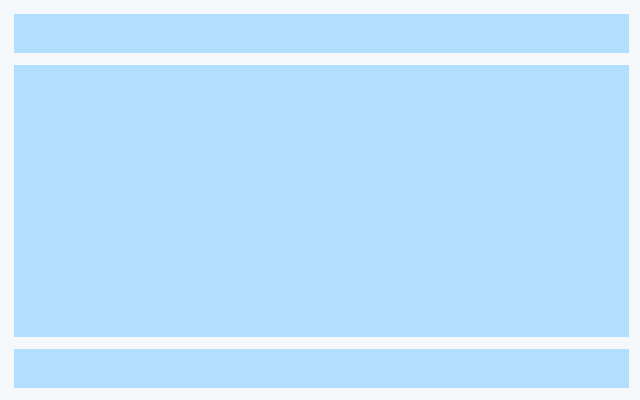
<div class="layout-01">
    <header>Header</header>
    <main>Content</main>
    <footer>Footer</footer>
</div>
.layout-01{width:640px;height:400px;background-color:#f9f9f9;display:flex;flex-direction: column;margin:10px auto;}
.layout-01 header{height:100px;border-bottom:2px #b2dfff solid;text-align:center;}
.layout-01 footer{height:100px;border-top:2px #b2dfff solid;text-align:center;}
.layout-01 main{flex:1;text-align:center;}应用语法:display:flex与flex-direction:column;
我们要对其模块做弹性布局首先第一父级需要display与flex-direction。
flex用于设置检索盒模型内子元素的空间分配,它是flex-grow、flex-shrink 和 flex-basis 属性的简写属性。
flex-direction是控制盒内元素方向的。其语法:
flex-direction: row|row-reverse|column|column-reverse|initial|inherit;该篇文章主要应用到row与column属性,即水平方位与垂直方位的显示。
接下来几个图例围绕这两个属性进行页面整体结构布局。
上下结构,中间左右分栏式web结构:
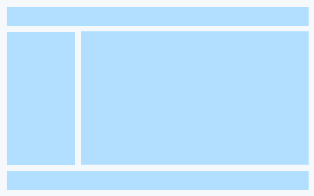
<div class="layout-02">
    <header>Header</header>
    <main>
        <aside>Aside</aside>
        <section class="content">Content</section>
    </main>
    <footer>Footer</footer>
</div>
.layout-02{width:640px;height:400px;background-color:#f9f9f9;display:flex;flex-direction: column;margin:10px auto;}
.layout-02 header{height:100px;border-bottom:2px #b2dfff solid;text-align:center;}
.layout-02 footer{height:100px;border-top:2px #b2dfff solid;text-align:center;}
.layout-02 main{flex:1;text-align:center;display: flex; flex-direction: row;}
.layout-02 main aside{width:150px;border-right:2px #b2dfff solid; }
.layout-02 main .content{padding:10px;flex:1;}这里我们可以看出,flex方法可以进行多次嵌套使用。
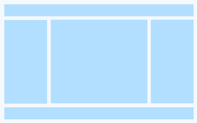
<div class="layout-03">
    <header>Header</header>
    <main>
        <aside>Aside</aside>
        <section class="content">Content</section>
        <aside>Aside</aside>
    </main>
    <footer>Footer</footer>
</div>
.layout-03{width:640px;height:400px;background-color:#f9f9f9;display:flex;flex-direction: column;margin:10px auto;}
.layout-03 header{height:100px;border-bottom:2px #b2dfff solid;text-align:center;}
.layout-03 footer{height:100px;border-top:2px #b2dfff solid;text-align:center;}
.layout-03 main{flex:1;text-align:center;display: flex; flex-direction: row;}
.layout-03 main aside{width:150px;border-right:2px #b2dfff solid; }
.layout-03 main aside:last-of-type{width:150px;border-left:2px #b2dfff solid;border-right:none;}
.layout-03 main .content{padding:10px;flex:1;}只需要对响应式内容设置flex:1即可。
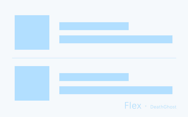
基本是就是这样子的啦,至于结构内板块内容细节布局,有些我们也是可以运用此方法,好比左右图文列表
<ul>
    <li>
        <a href="#" title="描述">
            <div class="pic">
                <img src="https://www.deathghost.cn/public/upload/article/2018/08/1533745610054.jpg" alt="" srcset="">
            </div>
            <div class="text">
                <h2>图片说明</h2>
                <p>描述性文本信息...</p>
            </div>
        </a>
    </li>
    <li>
        <a href="#" title="描述">
            <div class="pic">
                <img src="https://www.deathghost.cn/public/upload/article/2018/09/1537006566016.jpg" alt="" srcset="">
            </div>
            <div class="text">
                <h2>图片说明</h2>
                <p>描述性文本信息...</p>
            </div>
        </a>
    </li>
</ul>
ul{margin:0;padding:0;list-style: none;width:640px;margin:0 auto;}
ul li{border-bottom:1px #d2d2d2 solid;background-color:#f9f9f9;padding:20px;}
ul li:last-of-type{border:none;}
ul li a{display:flex;align-items:center;}
ul li .pic{width:150px;height:150px;border:1px #d2d2d2 solid;overflow:hidden;}
ul li .pic img{width:auto;max-width:100%;height:100%;}
ul li .text{margin-left:10px;}以上css样式只是临时性编写,实际项目中,大家可以将公共的class提取出来,避免重复书写,不论是用css原始写法或sass又或less编写,都很方便。
更多细节及相关语法大家可以参考网上一些资料,本篇就不再赘述了。
这篇文章由 DeathGhost 编辑,发布于